


Wednesday, Oct 1, 2025
Bring Nature Indoors with These Stunning Summer Color Palettes
We've seen clients repaint the same living room three times because they chose trendy colors they saw in magazines. Each time, they ended up right back where they should have started: soft summer palettes. These aren't the loud tropical colors people expect, unfortunately, but sunwashed tones that luxury hotels use because they know something most homeowners don't.
Designers Kristen and Carli explain why these muted tones work so well: "As with most muted or earthy tones, sage green pairs best with a softer cream, or opt away from your bright whites and yellow undertones and go for something with a green or greige undertone".
Heads Up! Don’t have much time to read? Bookmark this, or talk to Katherina and get suggestions specific to your needs. Click the chat icon to get started.
The Three Summer Palette Mistakes We See Most Often

Mistake #1: Going Too Pale
Last month, a homeowner painted her bedroom in what she called "the perfect pale blue." Within a week, she hated it, saying it felt like living in a hospital. The problem wasn't the color itself. She'd chosen a blue so pale it had no depth or personality. Just... nothing.
Summer palettes work because they're muted, not because they're sunny. Dusty rose has presence, Sage green reads as an actual color, and Powder blue creates an atmosphere. If your paint looks like someone diluted regular paint with too much white, you've gone too far.
Test this: Hold your paint sample next to pure white. If you can barely see the difference, pick a shade or two darker on that same paint strip.
Mistake #2: Mixing Warm and Cool Randomly
Here's what happened with another homeowner’s dining room (We’ll call her Megan, redacted name): She loved a dusty pink wall color (cool-toned) but paired it with honey oak furniture (warm-toned) and brass fixtures (warm-toned). The room never looked right, though she couldn't figure out why.
Summer palettes have cool undertones. That's what makes them feel fresh and airy. When you add warm woods and metals, you're creating visual tension that your brain processes as "off." Don’t get us wrong; it’s not terrible, but it’s also never quite right.
The fix: Choose light woods (ash, birch, light oak) over warm woods (cherry, honey oak). Pick chrome or brushed nickel over brass. Keep your metals cool-toned and your woods pale. The room makes sense when everything aligns.
Mistake #3: Forgetting Texture Entirely
A Texas couple painted their living room a beautiful muted blue-gray. They had white furniture, gray curtains, a pale rug, and some clutter. When we saw it, we understood why; the room felt flat and unwelcoming despite using the "right" colors.
Cool colors without texture feel institutional, like sterile offices. Period. You need chunky knit throws, velvet pillows, linen curtains, jute rugs, and varied fabrics to create visual interest and physical warmth. Without texture, summer palettes fail completely.
What Actually Works: Summer Colors Room by Room
Your Bedroom Needs Soft Summer Palettes

We've suggested probably 50 bedroom transformations using dusty rose or lavender-gray walls. These muted colors naturally lower heart rate and blood pressure (these are actual physiological effects, by the way). Your nervous system responds to these tones by shifting toward rest mode.
Paint your walls in dusty rose while keeping trim white. Add a sage green throw and a light gray upholstered headboard. Layer white linen sheets with texture: a chunky wool throw, velvet pillows in varying shades of rose and gray.
Install dimmer switches. This matters more than most people realize; you need bright light for getting dressed in the morning and soft light for winding down at night. It’s the same room, but you have different lighting needs.
Budget: $700 – $1,400 | Timeline: Weekend
Your Kitchen Works Best with Light Summer Colors

Kitchens need brightness for food prep and cooking. Light summer colors, like powder blue, pale yellow, and soft mint, reflect maximum light while adding personality.
We usually recommend painting lower cabinets in soft powder blue while keeping uppers white. This creates visual interest without overwhelming your cooking space. Blue naturally suppresses appetite slightly, which some people have found helpful.
Replace your hardware with brushed nickel or chrome. Add white quartz countertops. Install under-cabinet lighting on the white cabinets only, as blue cabinets absorb light, so they don't need the extra illumination.
Budget: $2,200 – $4,000 | Timeline: Week-long project
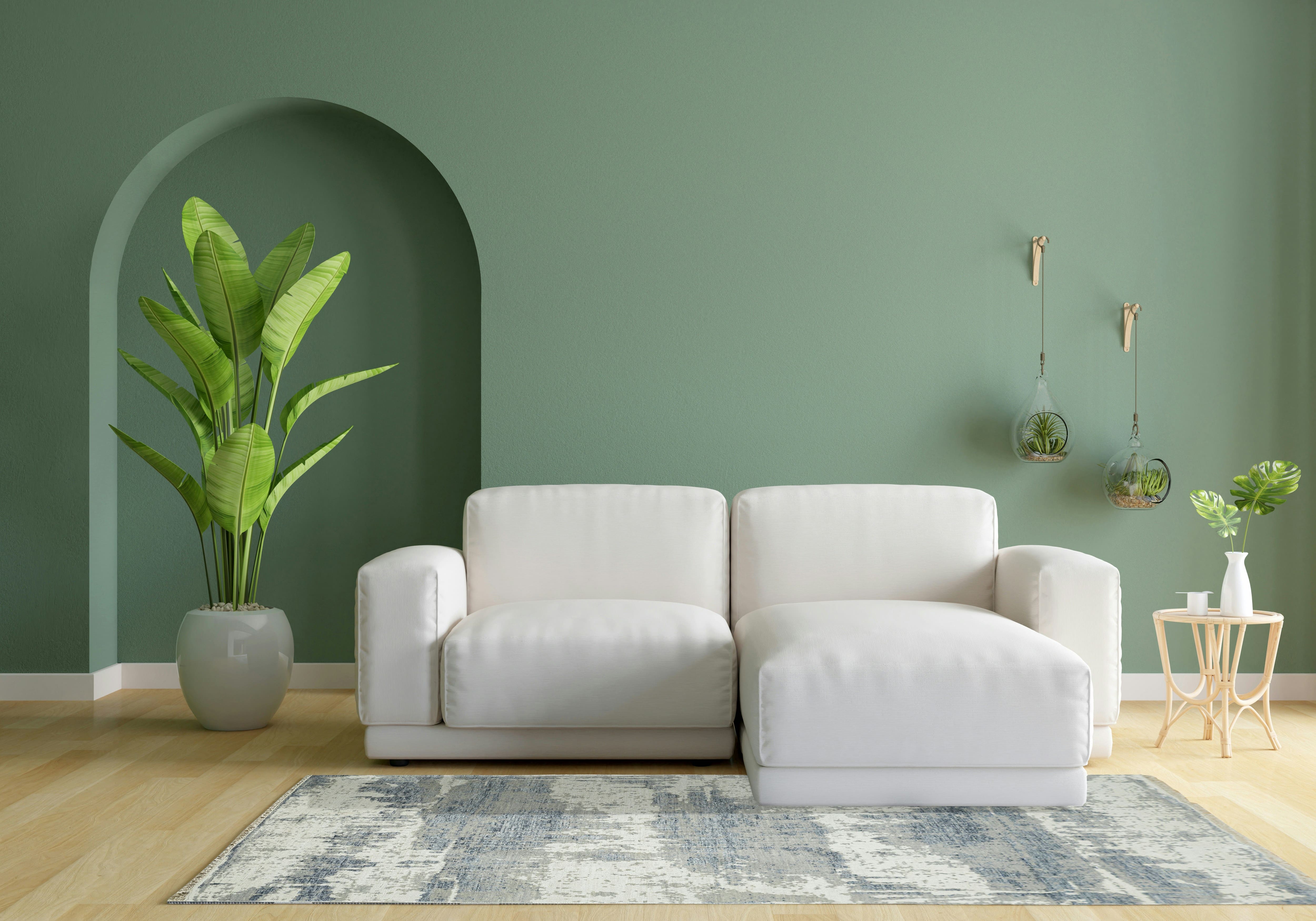
Your Living Room Can Go Either Direction

Living rooms work with both soft summer color palettes (muted, complex tones) and cool summer color palettes (crisper, cleaner tones), depending on your style preference and natural light.
North-facing living rooms benefit from soft summer warmth, like sage green, dusty rose, and warm gray. These prevent the cool natural light from making your room feel cold.
South-facing living rooms can handle cool summer tones, like periwinkle, icy blue, and soft purple. The warm southern light balances the cool paint colors perfectly.
Saviour painted his south-facing living room in soft periwinkle with white furniture and a gray rug. The warm afternoon sun hitting those cool walls creates this perfect balance of fresh and welcoming.
Budget: $1,000 – $2,000
Your Bathroom Gets the Spa Treatment

Small bathrooms are perfect for testing summer colors because:
- You use less paint (cheaper mistake if you hate it)
- Small rooms can handle more saturated versions
- Bathrooms benefit most from the "spa" feeling these colors create
Paint your walls in pale icy blue with white fixtures and chrome hardware. Add white towels and keep everything else minimal. The blue makes white fixtures appear cleaner while creating that luxury hotel bathroom vibe.
Or go with soft mint green for a gender-neutral option that feels fresh without being cold.
Budget: $600 – $1,500
Your Home Office Needs Cool Summer Color Palettes

We’ve helped set up dozens of home offices over the past few years, and the ones with cool summer palettes consistently get better feedback about focus and productivity.
Here’s how you do it: paint the wall behind your desk in soft periwinkle or pale icy blue. Keep the other walls white. Add white furniture and one piece of abstract art with cool summer tones.
The minimal color reduces visual distractions during video calls and focused work. The cool tones promote alertness without the overstimulation of bright colors.
Budget: $400 – $900
The Lighting Problem Nobody Tells You
Summer palettes fail when you use the wrong light bulbs. We've seen perfect paint colors look terrible because someone installed cool-white LED bulbs (5000K–6500K).
Cool colors + cool light = your home feels like an office building.
You need warm light bulbs (2700K–3000K) to balance cool paint colors. The warm artificial light prevents your rooms from feeling sterile, while the cool wall colors keep things fresh and airy.
Install dimmers everywhere: your bedrooms, living rooms, dining rooms, and even bathrooms. You need different light levels for different times of day and different activities. (Yes, yes, we’ve said this a zillion times, we know, but it’s true!).
Layer your lighting: table lamps, floor lamps, accent lighting. Never rely on a single overhead light. Multiple light sources create warmth and depth that single fixtures can't provide.

Texture Combinations To Use
For Bedrooms:
- Linen sheets (cool, crisp)
- Wool throws (warm, chunky)
- Velvet pillows (soft, luxurious)
- Jute rug (natural, grounding)
For Living Rooms:
- Linen curtains (airy, light-filtering)
- Velvet sofa or chairs (plush, inviting)
- Wool or jute rug (textured, warm)
- Rattan or light wood furniture (natural, light)
For Kitchens:
- Linen dish towels (practical, textured)
- Ceramic or stoneware (matte, natural)
- Light wood cutting boards (warm, functional)
- Woven baskets (textured, organizational)
These combinations create visual interest and physical warmth that prevents cool colors from feeling flat or like those boring offices.
When Summer Palettes Don't Work
We’re not going to pretend summer palettes work for everyone in every situation, because they don't.
Skip summer palettes if:
- You prefer bold, saturated colors
- Your home has minimal natural light (dark, muted colors will make it worse)
- You want your walls to be a focal point, not a backdrop
- You're naturally drawn to warm, earthy tones
Consider other options if:
- You live in a very cold region and want psychological warmth year-round
- Your furniture is already cool-toned, and all you need are warm walls for balance
- You have young children and worry about showing every fingerprint (though this depends on paint finish, not just color)
Summer palettes excel at creating calm, airy backdrops. If you want something different, energizing, cozy, or bold, look at autumn or winter palettes instead.
P.S. Did you know you can skip all the heavy research and talk to Katherina and get suggestions specific to your needs? Click the chat icon to get started.
Quick Answers to Questions Clients Ask
"Will this look too feminine?" Only if you style it that way. Dusty rose with charcoal gray furniture and chrome accents reads masculine. Same color with white furniture and gold accents reads feminine. The styling creates the gender read, not the paint color.
"Can I use summer colors in a rental?" Yes, but stick to removable elements: throw pillows, curtains, rugs, and artwork. Most landlords won't let you paint, and even if they do, you won't want to repaint when you move.
"How do I know if a color is cool-toned?" Compare it to pure white. Cool colors will have hints of blue, gray, or purple. Warm colors will have hints of yellow, orange, or red. If you can't tell, it's probably neutral-cool.
"What if I choose the wrong shade?" You probably will the first time. Most people do. Sample at least three shades in the same color family. Paint large swatches (2x2 feet minimum) on different walls. Live with them for several days, observing morning light, afternoon light, and evening artificial light.
"Do I have to hire a professional?" Not for painting. Most people can handle wall painting themselves. You might want professional help for:
- Kitchen cabinet painting (prep work is crucial)
- Furniture reupholstering (unless you're experienced)
- Custom window treatments
- Anything involving electrical or plumbing changes
Summer color palettes create homes that feel fresh and calming when you implement them correctly. These muted, cool tones provide psychological rest and visual lightness that trendy bold colors can't match. Just avoid the common mistakes, test your colors properly, and layer in plenty of texture, and you’re good to go!
Did you enjoy this read? Then you’ll love this comprehensive guide on Popular Living Room Paint Ideas for 2026.


