


Wednesday, Sep 24, 2025
15 Soft Autumn Color Palettes for Beautiful Home Interiors
Pinterest convinced you that autumn colors are orange pumpkins and bright red leaves. That's not autumn, that's a Halloween costume. Real autumn colors are muted, smoky, and sophisticated: dusty roses, sage greens, and warm taupes that create spaces so naturally harmonious, they feel like they designed themselves.
Elle Decor A-List designer Augusta Hoffman captures the true essence of soft autumn perfectly: "I think of it almost as a neutral," she says of muted greens, "though the shade can be prominent enough to set the mood in any space." This is what separates authentic autumn palettes from seasonal decorations; they're classy enough to anchor your entire design year-round.
Why Soft Autumn Colors Work in Interiors

Soft autumn palettes are psychologically grounding. These muted, warm-neutral tones create the same sense of security you feel watching the golden hour light filter through tree branches. They're low chroma colors, meaning they're softened with gray undertones, making them naturally harmonious and easy on the nervous system.
The science behind their appeal is simple: warm undertones (yellow and red bases) energize without overstimulating, while the muted quality prevents visual fatigue. Unlike bright seasonal colors that demand attention, soft autumn tones create a backdrop that lets your furniture, art, and natural light become the focus.
Interior designer Nina Lichtenstein explains why these earthy tones work so well together: "Sage green brings an earthy warmth that grounds a space, while [complementary muted tones] offer subtle contrast that complements rather than competes."
The Color Theory Behind Soft Autumn
Warm-Neutral Undertones: Based on yellow and red rather than blue, creating inherent warmth without brightness.
Smoky Depth: Slightly "grayed out" to prevent garishness while adding sophistication.
Low Chroma: Muted saturation that's naturally calming and creates effortless harmony.
How It Differs from Other Autumn Palettes:
- True Autumn Color Palette: Brighter, more saturated (think vibrant rust, golden yellow)
- Deep Autumn Color Palette: Darker, richer (deep olive, burgundy, chocolate brown)
- Soft Autumn Color Palette: Most muted and versatile, perfect for creating serene spaces
15 Soft Autumn Room Palettes
Living Rooms: Creating Warm Gathering Spaces

1. Sage & Cream Foundation: A serene combination that feels both modern and timeless. Paint your walls in Benjamin Moore "October Mist" (a sophisticated sage with gray undertones) and trim in "Cloud White" for contrast. Anchor that with a cream linen sectional and warm oak coffee table. Add some texture through chunky wool throws and ceramic vases in dusty rose.
Budget: $1,200 – $2,200 (includes paint, key textiles, and accent pieces).
Lighting: Use warm LED bulbs (2700K) in brushed brass floor lamps to create a golden-hour ambiance all day.
2. Dusty Rose Accent Wall: Transform your space with one feature wall in Sherwin-Williams "Intimate White" (a sophisticated dusty pink) while keeping the remaining walls in warm cream. This creates a cozy reading nook feeling without overwhelming the space. Pair with charcoal gray furniture and brass accents for modern sophistication.
Budget: $800 – $1,500
Key pieces: Velvet armchair in charcoal, brass pharmacy lamp, cream wool rug
3. Warm Taupe Sanctuary: Envelope your living room in Farrow & Ball "Elephant's Breath" for the ultimate cozy retreat. This complex taupe shifts between gray and beige throughout the day, creating depth and interest. Layer it in camel leather furniture and sage green accents through pillows and plants.
Budget: $1,500 – $2,800 (premium paint and leather investment pieces)
Texture focus: Smooth leather, nubby wool, polished wood
4. Muted Terracotta Statement: Use Benjamin Moore "Sedona Clay" on one accent wall to add earthy warmth without overwhelming. This works especially well behind a fireplace or media console. Keep your other walls neutral and add complementary colors through textiles and accessories.
Budget: $1,000 – $1,800
Designer tip: Designers recommend pairing earthy tones with "softer cream, or opt away from bright whites...go for something with a green or greige undertone."
5. Layered Neutral Textures: Start with Benjamin Moore "Natural Cream" walls as your canvas, then build complexity through varied textures. Mix linen upholstery, jute rugs, walnut wood, and matte ceramic accessories all within the soft autumn palette. Pay special attention to the layering, not bold color choices.
Budget: $2,000 – $3,500 (investment in quality textural pieces)
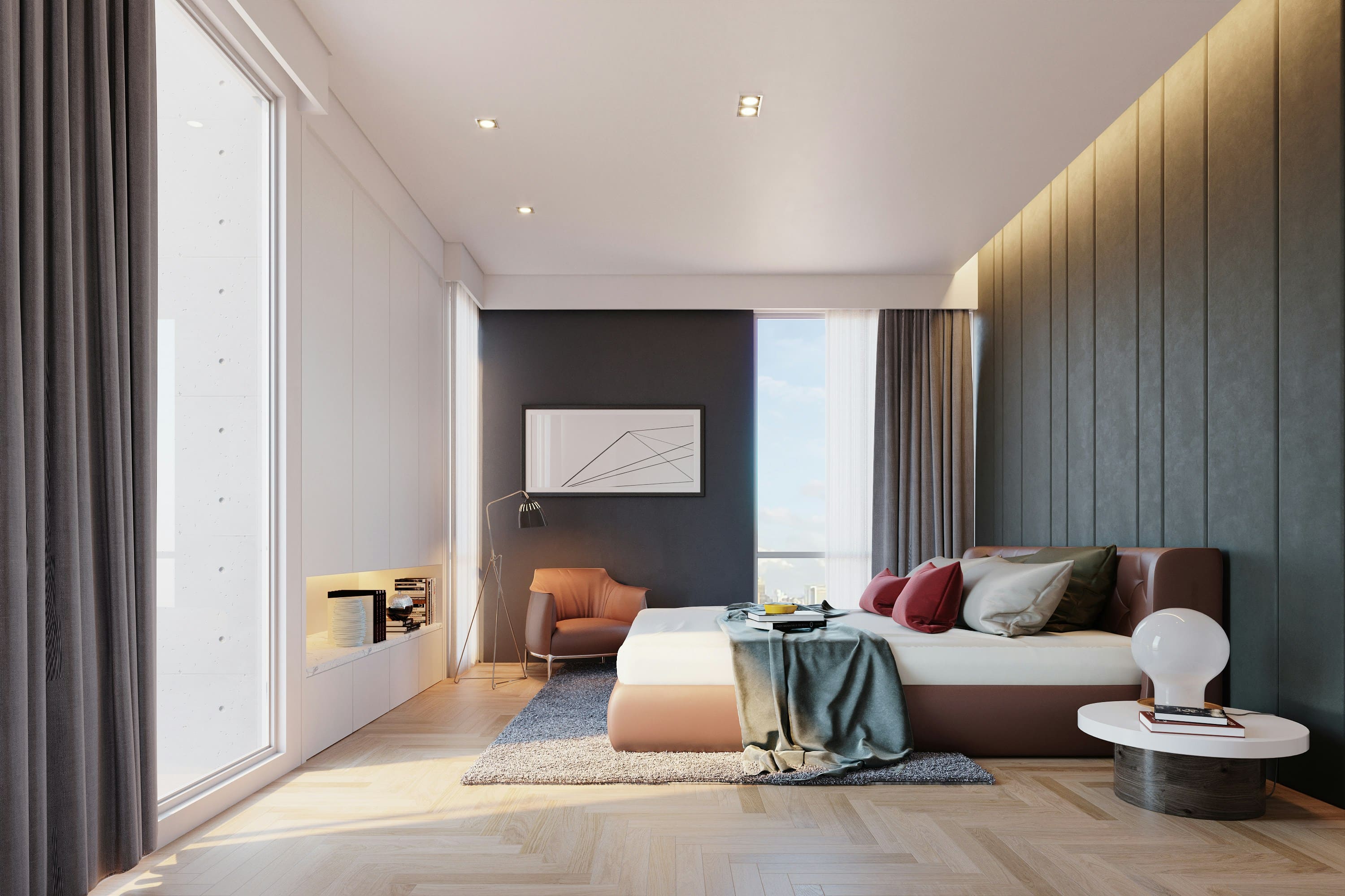
Bedrooms: Peaceful Retreats

6. Muted Gold Elegance: Create a sophisticated sleeping space with Sherwin-Williams "Blonde" walls and an upholstered headboard in muted gold velvet. Keep bedding neutral in creams and soft grays, letting the headboard be the statement piece. Add some warmth with brass bedside lamps and eucalyptus plants.
Budget: $1,200 – $2,000
Essential elements: Custom headboard, quality linen bedding, warm lighting
7. Sage Green Serenity: Benjamin Moore "Saybrook Sage" creates the perfect calm bedroom atmosphere. This versatile gray-green works with both warm and cool accents. Pair it with white oak furniture and cream bedding for a spa-like retreat that promotes restful sleep.
Budget: $900 – $1,600
Sleep psychology: Soft greens naturally lower stress hormones, promoting better rest.
8. Dusty Rose & Cream Romance: Use Sherwin-Williams "Romance" on an accent wall behind the bed to create subtle warmth without being overwhelming. Keep the other walls in soft cream and add layers through textiles in complementary muted tones. This palette works especially well in rooms with limited natural light.
Budget: $800 – $1,400
9. Warm Mushroom Cocoon: Benjamin Moore "Stone Hearth" creates an enveloping, womb-like feeling perfect for deep relaxation. This complex taupe-mushroom shade works beautifully with white bedding and dark wood furniture. Add texture through chunky knit throws and natural fiber rugs.
Budget: $1,000 – $1,800
Kitchens: Warm Culinary Spaces

10. Sage Green Cabinetry: Paint your lower cabinets in Sherwin-Williams "Clary Sage" while keeping the uppers in warm white to maintain brightness. This creates visual weight at the bottom while keeping your kitchen airy. Pair that with warm wood countertops and brass hardware for a timeless look.
Budget: $3,000–$6,000 (cabinet painting and hardware)
Professional tip: Use high-quality cabinet paint with a proper primer for durability
See more kitchen color ideas here.
11. Warm Wood & Muted Green Backsplash: Keep your cabinets in natural oak while adding color through a sage green subway tile backsplash. The natural wood warms the space while the muted tile adds sophistication. Complete this with brass fixtures and warm white walls.
Budget: $2,500 – $4,500 (tile and installation)
12. Terracotta Accent Kitchen: Use Benjamin Moore "Sedona Clay" on one accent wall (perhaps behind open shelving) while keeping cabinets neutral. This adds earthy warmth without overwhelming the functional space. Pair with cream cabinets and natural wood accents.
Budget: $2,000 – $3,500
Bathrooms: Spa-Like Interiors

13. Sage Green Spa: Transform your bathroom into a serene retreat with Benjamin Moore "Healing Aloe" walls. This soft gray-green creates instant calm while pairing beautifully with white fixtures and a natural wood vanity. Add some texture through woven baskets and linen towels.
Budget: $1,500 – $3,000
Wellness factor: Green tones naturally promote relaxation and restoration
14. Warm Taupe Elegance: Sherwin-Williams "Perfect Greige" creates a sophisticated bathroom atmosphere that works with both warm and cool metals. This versatile color adapts to your lighting throughout the day, always looking polished and intentional.
Budget: $1,200 – $2,800
15. Dusty Rose Powder Room: Make a statement in a small space with Benjamin Moore "Vintage Taupe" (a sophisticated dusty rose-taupe). This unexpected color choice creates a jewel-box effect in powder rooms. Pair with brass fixtures and a vintage-style mirror for maximum impact.
Budget: $800 – $1,800
Professional Implementation Guide

The 60-30-10 Rule for Soft Autumn:
- 60% Dominant neutral (wall color like warm taupe)
- 30% Secondary color (major furniture in sage or cream)
- 10% Accent colors (pillows, art in dusty rose or muted gold)
Lighting Considerations: Soft autumn colors shine under warm lighting (2700K-3000K). Cool LED bulbs will flatten these nuanced tones and make them appear muddy. Layer ambient, task, and accent lighting to create depth and interest.
Texture Combinations: Prevent flatness by mixing textures within your palette:
- Smooth: Polished wood, ceramic, brushed metals
- Textured: Chunky knits, jute rugs, stone surfaces
- Soft: Velvet, linen, wool upholstery
Seasonal Transitions: Switch textile weights and textures seasonally while keeping the core color palette. Add lighter linens in spring/summer, transition to wool and velvet in fall/winter.
Your Shopping & Coordination Guide
Paint Color Directory:
- Sage Greens: Benjamin Moore "October Mist," Sherwin-Williams "Clary Sage"
- Dusty Roses: Benjamin Moore "Vintage Taupe," Sherwin-Williams "Romance"
- Warm Neutrals: Farrow & Ball "Elephant's Breath," Benjamin Moore "Stone Hearth"
Budget vs. Investment Pieces:
- Save on: Textiles, accessories, DIY painted furniture
- Splurge on: Quality upholstered pieces, natural stone, hardwood floors

Frequently Asked Questions
What's the difference between soft autumn and generic warm neutrals? Soft autumn palettes include specific muted colors (dusty rose, sage, ochre) rather than just beige and cream. They're more complex and layered while still maintaining harmony.
How do I prevent the space from looking dated? Keep your furniture silhouettes clean and modern. The sophistication comes from the color harmony, not traditional styling. Mix in contemporary art and sleek lighting.
What colors should I avoid with soft autumn palettes? Skip bright, saturated colors (electric blue, hot pink), cool grays without warm undertones, and stark black or pure white. These will clash with the warm, muted harmony.
Can I use plants with this palette? Plants are perfect! Choose varieties with deep green foliage like fiddle leaf figs, olive trees, or eucalyptus. The natural greens complement the palette beautifully.
How do I mix different soft autumn colors? Start with one neutral base, add one main muted color (sage, dusty rose, or terracotta), then accent with a third tone. The low-chroma quality means they naturally harmonize.
Which rooms work best for soft autumn palettes? Living rooms and bedrooms are ideal, but kitchens and bathrooms become more welcoming and spa-like with these colors. The palette works anywhere you want to create calm sophistication.
Did you enjoy this read? Then you’ll love this article on popular living room paint ideas.


