


Wednesday, Jul 23, 2025
Beautiful Kitchen Paint Ideas For 2025
Let's be honest, your kitchen sees it all. The morning coffee mishaps, the spaghetti sauce splatters, the late-night snack sessions. So why shouldn't it feel as warm and welcoming as the memories you're making in it?
The right paint color can change your kitchen from "just a place to cook" into the heart of your home. Hey, we know what you’re thinking, but you don't need a designer's budget or a degree in color theory to get it right. You just need a little courage, some smart planning, and maybe a friend to hold the ladder.
We've been watching our Snug Squad members work magic with nothing more than a few cans of paint and weekend determination. From tiny rental galleys to sprawling suburban kitchens, they're proving that the most beautiful transformations often start with the simplest tools. Ready to join them?
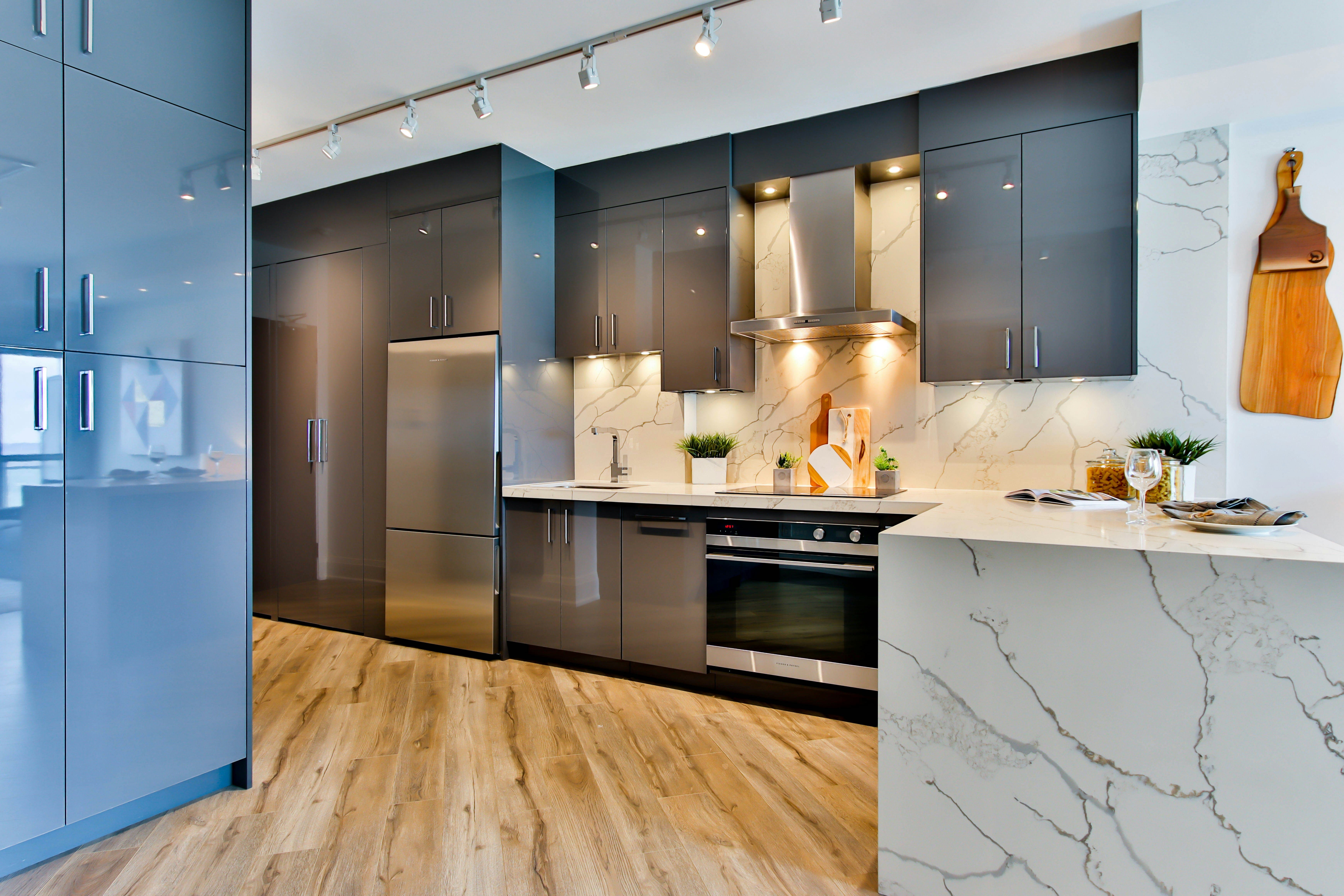
Heads Up! We generated some of these images to serve as a visual guide.
1. The Calming Sage Green

There's something deeply calming about sage green that makes your kitchen feel like a gentle hug every time you walk in. It's not the bold, attention-grabbing green you’re more familiar with, but rather a soft, muted shade that whispers rather than shouts. Think of the color of eucalyptus leaves or weathered sea glass, earthy, elegant, and soothing.
What makes sage green so brilliant for kitchens is its chameleon-like quality. In morning light, it feels fresh and energizing. As evening settles in, it becomes warm and cocoon-like. Our Snug Squad member Annelian discovered this firsthand when she painted just her lower cabinets in Sherwin-Williams Clary Sage, leaving the uppers white for contrast. The result? A kitchen that feels both grounded and airy, and she saved nearly $600 by doing the work herself over two weekends.
The beauty of this approach is that you don't have to commit to green everywhere. Try it on your kitchen island first, or paint the insides of open shelving for a surprise pop of color that only you'll see when reaching for your favorite mug. And here's where it gets exciting: with our room scanning feature launching soon, you'll be able to visualize exactly how that sage green will look in your actual space before you buy a single can of paint. No more guessing games or expensive mistakes. Pair sage with warm brass hardware and natural wood accents, and you've got a space that feels both current and timeless.
2. The Drama of Deep, Moody Blues

If you've been playing it safe with neutrals, it might be time to embrace your bold side. Deep navy blues and inky teals are having a major moment, and for good reason. These colors bring an unexpected sophistication to kitchens, making even the most basic space feel like it belongs in a design magazine.
The secret to pulling off a moody blue is balance. Paint your lower cabinets in a rich navy like Benjamin Moore's Hale Navy, but keep your walls and upper cabinets light and bright. This creates a beautiful visual anchor without making the space feel cave-like. Rebeccah from our community tried this exact combination and couldn't believe how much larger her galley kitchen appeared (the dark base made the ceiling seem higher by drawing the eye upward).
Don't worry about the space feeling too dark during the day. These deep blues have a magical quality in natural light, shifting from dramatic to serene as the sun moves across your windows. Add some warm brass or copper accents, and you'll have a kitchen that feels both cozy and incredibly stylish. Just remember to invest in good under-cabinet lighting to keep your workspace bright and useful.
3. Two‑Tone Cabinets: Top Light, Bottom Dark

Why choose one color when you can have two? That’s where two-tone cabinets come in; they give you just enough drama while keeping your kitchen feeling balanced and intentional. The classic approach is to pair darker lower cabinets with lighter uppers, but the beauty is in how you interpret "dark" and "light."
Maybe your version is soft sage green on the bottom with creamy white on top. Or perhaps you're feeling adventurous with deep charcoal lowers and pale blush uppers. Zul from Tokyo nailed this look with Studio Green lower cabinets and IKEA's white HÄGGEBY uppers, creating a space that feels very personal. The total cost? Just over $450 for a completely transformed kitchen.
The trick to making two-tone work is making sure your colors share an undertone. If your dark shade leans warm (with hints of brown or red), make sure your light shade does too. Cool grays pair beautifully with cool whites, while warm beiges love cream and off-white companions. This creates a cohesive look that feels intentional rather than accidental. When our platform launches, you'll be able to test these combinations instantly in your actual kitchen using our drag-and-drop interface, no more painting sample squares on the wall and hoping for the best. Join our waitlist here.
4. The Warmth of Terracotta and Clay

There's something about warm, earthy colors that makes a kitchen feel more lived-in and homey. Terracotta, burnt orange, and deep clay shades are painting their way into kitchens everywhere, bringing a sense of global wanderlust and handcrafted charm. These aren't the bright, primary colors you might be familiar with on old blogs or magazines, but rather sophisticated, muted tones that feel both otherworldly and welcoming.
You don't need to paint every surface terracotta to get the effect. Try it as an accent wall behind open shelving, or use it to highlight a breakfast nook or coffee station. Pair these warm tones with plenty of neutral balance, consider creamy whites, soft grays, or natural wood tones.
What makes these colors so special is how they change throughout the day. In morning light, they feel energizing and optimistic. As evening approaches, they become incredibly cozy and intimate (perfect for family dinners if you ask us).
5. Stay Simple with Warm Whites and Creams

Not all whites are created equal, and in 2025, we’re all about embracing the warmer, creamier side of the spectrum. We're moving away from stark, cool whites toward shades that feel like they've been kissed by candlelight, like clotted cream, warm linen, or the inside of a seashell.
The magic of warm whites is in their subtlety. They provide all the brightness and spaciousness of traditional white kitchens, but with a softness that feels less clinical. Consider color-drenching your space; painting walls, trim, and even the ceiling in the same warm white hue. This technique blurs the architectural lines and makes the room feel larger.
Mrs. Bourne tried this approach with Benjamin Moore's White Flour, and the result was a kitchen that felt both spacious and incredibly cozy. She paired it with warm brass hardware and natural wood accents, creating a kitchen space that works beautifully with both modern and traditional elements. Want to guess the best part? Warm whites are incredibly forgiving and work with virtually any accent color you might want to introduce later.
6. Be Cheerful Energy with Soft Yellows

Sunshine in a can (not Fanta, hehe), that's what soft, buttery yellows bring to a kitchen. But we're not talking about the bright, primary yellow of children's playrooms. These are classy, creamy yellows that feel like warm morning light filtering through sheer curtains. They feel happy and optimistic without being overwhelming, cheerful without being childish.
Yellow is particularly magical in kitchens that don't get a lot of natural light. It instantly brightens and warms the kitchen, making even the gloomiest morning feel more hopeful. Try it on an accent wall behind your coffee station, or be bold and paint your kitchen island in a soft, buttery shade..
You’d want to keep everything else relatively neutral. Pair it with crisp whites, soft grays, or natural wood tones. Add some greenery, like herbs on the windowsill, a small potted plant, and you've created a space that feels like perpetual spring or the fountain of youth ;)
Just remember to test your color in different lighting conditions; yellow can shift dramatically from morning to evening.
7. Be Classy with Textured Finishes

Although black is often associated with magnificence, sometimes classiness is not just about color. Texture can also change a kitchen just as dramatically as any shade. Limewash walls, fluted cabinet fronts, and matte finishes are adding depth and character to kitchens in ways that flat paint simply can't match. These techniques create surfaces that catch and play with light, adding visual interest without busy patterns or bright colors.
Limewash, in particular, is having a major moment. This ancient technique creates a soft, organic texture that’s both rustic and refined. Try it on a feature wall in a soft, neutral tone, like a warm gray or gentle beige. The subtle variation in color and texture will give your kitchen a custom, handcrafted feel that's impossible to achieve with regular paint.
8. Pop Lots of Colors

Here's a secret that designers have been using for years: painting the inside of your cabinets is like giving wings to a tiger, who in this case happens to be your beautiful kitchen. It's a private little surprise that makes you smile every time you reach for a plate or glass. And because it's hidden behind doors most of the time, you can be as bold as you want without worrying… think of it as creating funny memories.
Try vibrant coral inside your coffee mug cabinet, or a rich teal behind your glassware. The effect is to live for, like discovering a secret room in your own home.
This technique works especially well with open shelving, where the pop of color becomes part of the overall design scheme. Choose a shade that complements your main palette but feels a little more adventurous. Maybe it's a deeper version of your wall color, or perhaps it's a completely different hue that brings out undertones in your countertops or backsplash.
9. Go Global with Mixed Palettes

Why limit yourself to Western color traditions when the world offers such a rich palette of inspiration? Drawing from global design traditions, like the deep saffrons of Moroccan riads, the soft blues of Greek island homes, or the warm terracottas of Tuscan villas, can create a kitchen that feels both otherworldly and quite unique.
Choose colors that speak to your own experiences and dreams. Maybe you fell in love with the dusty pinks of Jaipur, or you can't stop thinking about the sage greens of Provence. Use these memories and aspirations as your starting point, then adapt them to work with your existing architecture and lifestyle.
Aniel, from our community, created a stunning space by combining influences from her travels, soft sage cabinets inspired by olive groves in Crete, warm terracotta accents reminiscent of Moroccan pottery, and brass hardware that evokes Turkish bazaars. The result is a kitchen that tells her story and makes every meal feel like a mini adventure.
10. The Unexpected: Painted Ceilings

The ceiling is often called the fifth wall, but it's probably the most neglected surface in most homes. Painting your kitchen ceiling a color other than white is a bold move that can completely change the character of your space. It's different, unexpected, and shows real design confidence… maybe also a bit of unhingeness, hehe.
If you’ve got high ceilings, consider a deep, moody color like charcoal or navy blue. This creates intimacy and makes the space feel more human-scaled. In smaller kitchens, a soft blue or pale pink can make the ceiling seem higher and the room more spacious.
Remember: keep the walls relatively neutral so the ceiling can be the star. This technique works especially well in kitchens with interesting architectural details, like beams, coffered sections, or unusual angles. The colored ceiling draws attention to these features and makes them part of the overall design story rather than just structural necessities.

Start Painting Today
Kitchen transformations don't happen overnight, and they don't require perfection. The most beautiful kitchens are the ones that evolve with their owners, growing and changing as life happens within their walls. Your first paint project might be a single accent wall or just the interior of your coffee cabinet. That's not just okay, it's a perfect start.
This is exactly why we're building All Things Snug: to make these transformations less scary and more exciting. Our upcoming platform will let you scan your actual kitchen, try different paint colors in real 3D, and even share your designs with our community for friendly feedback from other renters, homeowners, and even professionals. No more paint regret, no more expensive mistakes, just confident design decisions that make your heart sing.
Start small, dream big, and remember that every expert was once a beginner. Right now, grab some sample pots, paint a few swatches, and see how the colors make you feel. Does that sage green make you want to linger over your morning coffee? Does the warm white make you excited to host Sunday brunch? Trust those feelings; your kitchen should be a reflection of how you want to live.
Want more budget-friendly home design inspiration? Join our waitlist and thousands of DIY enthusiasts creating beautiful, affordable spaces. Design like a pro, even if you're just starting out! You can also follow us on social media.


